30.) Miami Marlins
I honestly prefer their old teal and black uniform that they wore when they were winning World Series while doing firesales. This new uniform is just bad. Mixing Orange and Green sounded nice (I mean, the Dolphins do it), but adding yellow and black just make it a complete mess.
29.) San Diego Padres

Just a boring imitation of better unforms, with nothing special at all. The font is cursive on one uniform and block-letter on the other, which is a strange mix. The camo-uniform has really outwork its welcome to me, and the 'SD' stylized crest is just trying to copy the umpteen other teams who have done it. At least they stopped using that sand colored one.
28.) Atlanta Braves

Just like the team was during the early 2000's, the uniform is just so boring. The gray uniforms look dull for a lot of teams, but especially so with Atlanta, who's deep red and blue don't pop at all. I also am docking them major points for switching to radial arches letters instead of vertical arched letters on the back (look it up if you don't understand what that means).
27.) Cleveland Indians

The Indians combine a lot of the elements that made the Padres and Braves low ranking. They have the boring, almost identically colored, look of the Braves. They have the mix of cursive and block letters with home and away uniforms. And they lose a lot of points for still using the Chief Wahoo, although to their credit they have definitely lessened its use over the past few years.
26.) Arizona Diamondbacks

When they unveiled their current uniform back in 2007, it seemed like a huge ripoff of the Astros, with the same color scheme. Now their alone with the colors, but it always worked better with Houston's cursive than the weird D'Back font. Also, trying to have 'Arizona' in that font gives a look that is way too busy. I do like that they kept the old 'A' logo for their alternate.
25.) Tampa Bay Rays

It's a more notable look over their previous green jersey, but that is probably more to do with their success with this uniform and long history of no success with the old one. My main problem with the Rays look is the way the "Rays" is put, with a clean, way too corporate looking feel. I may be being overly harsh, but what really kills me is the little star in the 'R' in the road and alternates.
24.) Texas Rangers

The Rangers could use some pinstripes. Jersey's that just have the name, with no stylized writing, just look to plain at times. The Rangers jersey's definitely have that effect. I believe the Rangers are the only team that has the Location on both jerseys and not use the Nickname at least once. I would like to see 'Rangers' on the home one, as it would take some more space. That Blue alternate, which they use a lot, is also a little jarring.
23.) Milwaukee Brewers

Way too many options, especially when the best is the throwback that they probably won't go back to. I like the color scheme, but I would love to have them put 'Milwaukee' in cursive on the road uniform. That color scheme is just a little boring, and I think they use too much blue and too little yellow, although judging by that ugly yellow alt, maybe using more yellow would be a bad idea.
22.) Chicago White Sox

Way too much black for a team called the "White Sox". The pinstripes is unnecessary, as it seems like they're trying too hard to match the Cubs pinstripes. I do like the SoX logo used on the home and alternate black uni, but then the cursive seems out of place. It's like they tried to have the home look of an old fashoined team and road look of a modern one. I do like the 70's red S-O-X throwback.
21.) New York Mets

Kill those blue jerseys. Their old black alternates were far better and less jarring. That blue just makes all the writing on the jersey unreadable. The other jerseys are really nice. They're one of just a few teams to use pinstripes and not a crest, but actually have writing. Also, love the stylized corners of the letters in 'New York'. If they just got rid of those alternates they use a lot, it would be so much better.
20.) Houston Astros

The Astros changed uniforms when they changed leagues and owners, and I don't know if it is an improvement. The color scheme is nice, pretty unique with that dark orange and dark blue, but I have two problems with the uniforms. First, the clunky wording, and secondly, the simple 'H' over a Star logo. Maybe it will grow on me, but for now I'm not a huge fan. I do really like that burnt orange alternate, though.
19.) Colorado Rockies

I want to like the Rockies' uniforms. I like the idea of purple being a trim color, but they've removed the purple over the years, especially for their home uniform. That purple strip on the buttons looks so sharp on the road uniform, but there's nothing purple at all with the home uniform. The purple alternate might be a little too much as well. That road uniform is just so good it makes up for it though.
18.) Minnesota Twins

Seeing that 'Minnesota' in cursive is why I think the Brewers should do the same thing with Milwaukee. They're one of the few teams to have uni numbers on the front and not make it look too crowded. Love that old cream alternate (I love almost all cream alternates floating around). My issue mainly is with that odd quasi-cursive stylized 'Twins' on their home and blue alternate uniform.
17.) Toronto Blue Jays

I love a lot of this uniform, but the one thing I don't like is the primary reason they look like what they do right now: that stylized way of writing BLUE JAYS. I realize that how it looked in their back-to-back title years, but it just looks amateurish. I do love the logo appearing on the front of the jersey, a far better alternative than putting a number. Those road uniforms look sharp, one of the few teams in MLB where I actually prefer the road uniform.
16.) Washington Nationals

Sharp colors, nice logo, there's a lot to like about the Nationals. They did try to go old school with using just the logo for hte home uni, but at least they didn't go pinstripes. I also love how they used the 'W' logo in the 'Washington' in teh road uniform (another sharp looking road uniform). Also really like the red border running down the buttons on the home uniform. The logo numbers aren't great on the home and alternate red uniform, and that Red White and Blue thing is terrible, but the pros outweigh the cons.
15.) Los Angeles Angels

Sharp looking team, all in all (they all are in this Top-16). I really have no quibbles other than that third uniform. Red is just not a good color to use for a uniform background, especially when the lettering is all in red as well. That red-over-red ruins what is a Top-10 level home and road set.
14.) Seattle Mariners

Great color scheme with the teal and dark blue. Great logo, consistent font for both home and road. The home uniform looks really sharp with the thin stripe on the buttons, and just enough use of green trim to make the words pop even more. I actually really like the team alternate, something completely unique in modern NFL professional sports. I wish they would use it more.
13.) Boston Red Sox

Might seem low, but this ranking is what you get when you combine a Top-5 home uniform, with a bottom-10 road uniform, with two middling alternates. The road uniform is way too simplistic and dull. No use of Red at all. It was an interesting decision to return to their roots with that uniform, but for me it just doesn't work. The home one makes up for it though, as it is as shark as any home uniform. Splitting 'Red' and 'Sox' to either side of the buttons was a great decision, making it seem full and not clunky at the same time. Just awesome.
12.) Los Angeles Dodgers

Another seemingly classic uniform that I don't like as much as most. Now, it is a great uniform, with good use of cursive, sharp blue colors, and a timeless look, but I have to issues. The first is numbers on the front of the uniform, which I've never really liked in baseball, and then the fact the numbers are red. It's just a jarring, nonsensical contrast. It's been like that forever, so I can't blame modern uniform issues screwing it up, but if that was blue it would be close to Top-5.
11.) Chicago Cubs

It goes up three or four spots because of the Bear logo for the alternate, and the bear logo shoulderpatch on the home and road uniform. Other than the Yankees, pinstripes never look better as well, complimenting a beautifully simplistic uniform. I don't love the CHICAGO in the road uniform, but the bear logo is too good.
10.) San Francisco Giants

It's a great uniform that honestly could look better. They have a great color scheme (as seen by Baltimore, which is still to come), and they make good use of it. They don't use the orange alternate too much anymore (which is a good thing), in lieu of using the old school SF-crest uniform, which is awesome. The home uniform is just stunning, a timeless classic that will never look bad. Even the road, the thin 'San Francisco' just looks really good. Wish there was more orange, though.
9.) Cincinnati Reds

The best non-block solid-color alternate elevates the Reds a bit. They realized that when you have a solid-color background having a lot of writing is always a challenge, so they use just the logo and number, which works really well. Elevating the number to the chest also looks really nice on the home uniform. The road uniform has great lettering, and more than enough red to overcome the dull gray.
8.) Kansas City Royals

The light-blue solid color gives the Reds' one a run for its money (and makes up for the less-used solid blue), but they have such a great combination of home and road uniforms. I love uniforms that have just two colors, the primary color and white. Many of the top-8 will have that (and #'s 10 and 9 did as well), and few look as good as the Royal home uniform. The 'Royals' is so clean. 'Kansas City' is more problematic on the road one, but that shoulder logo is great.
7.) Detroit Tigers

Might be the best home uniform in MLB outside of my Top-2 teams. So simple, so effective. Love the cap as well (haven't mentioned many caps because they rarely change my opinion). The white logo on the hat matching the reverse on the chest works well. The piping on the buttons is great. The difference between home and road may be larger here than anywhere else, but it works. The orange trim of the lettering makes it pop off the gray. Great look.
6.) Baltimore Orioles

That solid-black alternate may be my favorite alternate uniform in use. They use it a lot as well. So sharp, so good, with the orange 'Orioles' just jumping off the black background. The orange on white has essentially the same impact. Love the use of the bird logo as a shoulderpatch for the home and road unis as well. I also love the white panel on the cap for the home and alternate uniform. Overall, a perfect match of old-school and new-school uniform elements.
5.) Philadelphia Philles

They should ditch the pinstripes for that alternate cream look, which is incredible sharp as a retro look. Not that the pinstripes look bad, because they don't. Love the stars as the dots for the 'i's', and the deep red making the road uniform look shark and not dull. I just can't get enough of that cream alternate, though. Just an incredible old-school look.
4.) Pittsburgh Pirates

One of the best parts of the Pirates' revival last year was people getting to appreciate their amazing uniform sets. Every iteration looks shark. The yellow makes the lettering absolutely pop off the road uniform. The home uniform is simple and classy in its simplicity. That solid-black alternate is about as good as the Orioles black-alternate. Black and Yellow work in Pittsburgh, and they really work here. The black and yellow is a theme that pervades in every uniform so well.
3.) Oakland Athletics

Somehow, the yellow trim doesn't work as well here for the road uniform, but good lord are their other three uniforms awesome. The home look is the best (apart from the Top-2). The solid-green is an incredible sharp look, contrasting perfectly with the yellow lettering. Even the all-yellow alternate is sharp, with a dark yellow. All in all, green and yellow is a great mix of colors. The elephant logo also appears a few times, which adds to any uniform. Even the consistent use of cursive is nice. There are just no mistakes with this uniform.
2.) St. Louis Cardinals

These top two were incredibly close. No team has better lettering, with the two ebroidered Cardinals adornng the team name and the bat. It's a complicated piece of art, but looks so nice and fits so perfectly across the chest of the uniform. That 'St. Louis' alternate is beautiful, keeping the elements that make the Cardinals uniform unique but add a great retro mix to it. Both the red and black caps work perfect with either uniform. I love how the road uniform removes the blue and goes with just red, allowing for it to pop off the gray. Just an amazing job.
1.) New York Yankees
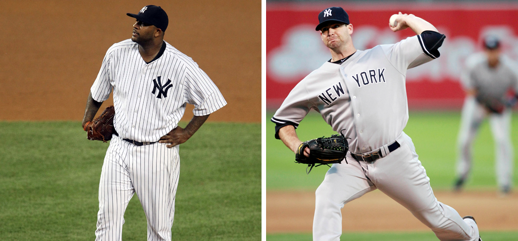
Honeslty, who else. It may be a boring choice, but that home uniform is just special. So simple, so elegant, pintsripes work here when they don't almost anywhere else. The cap contrast works here just as it works in Detroit. The road uniform avoids the idea of putting uniform numbers on the front, leaving it simple but elegant. Love the little stripe near the end of the sleeve on the road uniform. They just look so damn professional, so good in both forms. And their aversion to an alternate has to be credited.
I honestly prefer their old teal and black uniform that they wore when they were winning World Series while doing firesales. This new uniform is just bad. Mixing Orange and Green sounded nice (I mean, the Dolphins do it), but adding yellow and black just make it a complete mess.
29.) San Diego Padres
Just a boring imitation of better unforms, with nothing special at all. The font is cursive on one uniform and block-letter on the other, which is a strange mix. The camo-uniform has really outwork its welcome to me, and the 'SD' stylized crest is just trying to copy the umpteen other teams who have done it. At least they stopped using that sand colored one.
28.) Atlanta Braves
Just like the team was during the early 2000's, the uniform is just so boring. The gray uniforms look dull for a lot of teams, but especially so with Atlanta, who's deep red and blue don't pop at all. I also am docking them major points for switching to radial arches letters instead of vertical arched letters on the back (look it up if you don't understand what that means).
27.) Cleveland Indians
The Indians combine a lot of the elements that made the Padres and Braves low ranking. They have the boring, almost identically colored, look of the Braves. They have the mix of cursive and block letters with home and away uniforms. And they lose a lot of points for still using the Chief Wahoo, although to their credit they have definitely lessened its use over the past few years.
26.) Arizona Diamondbacks
When they unveiled their current uniform back in 2007, it seemed like a huge ripoff of the Astros, with the same color scheme. Now their alone with the colors, but it always worked better with Houston's cursive than the weird D'Back font. Also, trying to have 'Arizona' in that font gives a look that is way too busy. I do like that they kept the old 'A' logo for their alternate.
25.) Tampa Bay Rays
It's a more notable look over their previous green jersey, but that is probably more to do with their success with this uniform and long history of no success with the old one. My main problem with the Rays look is the way the "Rays" is put, with a clean, way too corporate looking feel. I may be being overly harsh, but what really kills me is the little star in the 'R' in the road and alternates.
24.) Texas Rangers
The Rangers could use some pinstripes. Jersey's that just have the name, with no stylized writing, just look to plain at times. The Rangers jersey's definitely have that effect. I believe the Rangers are the only team that has the Location on both jerseys and not use the Nickname at least once. I would like to see 'Rangers' on the home one, as it would take some more space. That Blue alternate, which they use a lot, is also a little jarring.
23.) Milwaukee Brewers
Way too many options, especially when the best is the throwback that they probably won't go back to. I like the color scheme, but I would love to have them put 'Milwaukee' in cursive on the road uniform. That color scheme is just a little boring, and I think they use too much blue and too little yellow, although judging by that ugly yellow alt, maybe using more yellow would be a bad idea.
22.) Chicago White Sox
Way too much black for a team called the "White Sox". The pinstripes is unnecessary, as it seems like they're trying too hard to match the Cubs pinstripes. I do like the SoX logo used on the home and alternate black uni, but then the cursive seems out of place. It's like they tried to have the home look of an old fashoined team and road look of a modern one. I do like the 70's red S-O-X throwback.
21.) New York Mets
Kill those blue jerseys. Their old black alternates were far better and less jarring. That blue just makes all the writing on the jersey unreadable. The other jerseys are really nice. They're one of just a few teams to use pinstripes and not a crest, but actually have writing. Also, love the stylized corners of the letters in 'New York'. If they just got rid of those alternates they use a lot, it would be so much better.
20.) Houston Astros
The Astros changed uniforms when they changed leagues and owners, and I don't know if it is an improvement. The color scheme is nice, pretty unique with that dark orange and dark blue, but I have two problems with the uniforms. First, the clunky wording, and secondly, the simple 'H' over a Star logo. Maybe it will grow on me, but for now I'm not a huge fan. I do really like that burnt orange alternate, though.
19.) Colorado Rockies
I want to like the Rockies' uniforms. I like the idea of purple being a trim color, but they've removed the purple over the years, especially for their home uniform. That purple strip on the buttons looks so sharp on the road uniform, but there's nothing purple at all with the home uniform. The purple alternate might be a little too much as well. That road uniform is just so good it makes up for it though.
18.) Minnesota Twins
Seeing that 'Minnesota' in cursive is why I think the Brewers should do the same thing with Milwaukee. They're one of the few teams to have uni numbers on the front and not make it look too crowded. Love that old cream alternate (I love almost all cream alternates floating around). My issue mainly is with that odd quasi-cursive stylized 'Twins' on their home and blue alternate uniform.
17.) Toronto Blue Jays
I love a lot of this uniform, but the one thing I don't like is the primary reason they look like what they do right now: that stylized way of writing BLUE JAYS. I realize that how it looked in their back-to-back title years, but it just looks amateurish. I do love the logo appearing on the front of the jersey, a far better alternative than putting a number. Those road uniforms look sharp, one of the few teams in MLB where I actually prefer the road uniform.
16.) Washington Nationals
Sharp colors, nice logo, there's a lot to like about the Nationals. They did try to go old school with using just the logo for hte home uni, but at least they didn't go pinstripes. I also love how they used the 'W' logo in the 'Washington' in teh road uniform (another sharp looking road uniform). Also really like the red border running down the buttons on the home uniform. The logo numbers aren't great on the home and alternate red uniform, and that Red White and Blue thing is terrible, but the pros outweigh the cons.
15.) Los Angeles Angels
Sharp looking team, all in all (they all are in this Top-16). I really have no quibbles other than that third uniform. Red is just not a good color to use for a uniform background, especially when the lettering is all in red as well. That red-over-red ruins what is a Top-10 level home and road set.
14.) Seattle Mariners
Great color scheme with the teal and dark blue. Great logo, consistent font for both home and road. The home uniform looks really sharp with the thin stripe on the buttons, and just enough use of green trim to make the words pop even more. I actually really like the team alternate, something completely unique in modern NFL professional sports. I wish they would use it more.
13.) Boston Red Sox
Might seem low, but this ranking is what you get when you combine a Top-5 home uniform, with a bottom-10 road uniform, with two middling alternates. The road uniform is way too simplistic and dull. No use of Red at all. It was an interesting decision to return to their roots with that uniform, but for me it just doesn't work. The home one makes up for it though, as it is as shark as any home uniform. Splitting 'Red' and 'Sox' to either side of the buttons was a great decision, making it seem full and not clunky at the same time. Just awesome.
12.) Los Angeles Dodgers
Another seemingly classic uniform that I don't like as much as most. Now, it is a great uniform, with good use of cursive, sharp blue colors, and a timeless look, but I have to issues. The first is numbers on the front of the uniform, which I've never really liked in baseball, and then the fact the numbers are red. It's just a jarring, nonsensical contrast. It's been like that forever, so I can't blame modern uniform issues screwing it up, but if that was blue it would be close to Top-5.
11.) Chicago Cubs
It goes up three or four spots because of the Bear logo for the alternate, and the bear logo shoulderpatch on the home and road uniform. Other than the Yankees, pinstripes never look better as well, complimenting a beautifully simplistic uniform. I don't love the CHICAGO in the road uniform, but the bear logo is too good.
10.) San Francisco Giants
It's a great uniform that honestly could look better. They have a great color scheme (as seen by Baltimore, which is still to come), and they make good use of it. They don't use the orange alternate too much anymore (which is a good thing), in lieu of using the old school SF-crest uniform, which is awesome. The home uniform is just stunning, a timeless classic that will never look bad. Even the road, the thin 'San Francisco' just looks really good. Wish there was more orange, though.
9.) Cincinnati Reds
The best non-block solid-color alternate elevates the Reds a bit. They realized that when you have a solid-color background having a lot of writing is always a challenge, so they use just the logo and number, which works really well. Elevating the number to the chest also looks really nice on the home uniform. The road uniform has great lettering, and more than enough red to overcome the dull gray.
8.) Kansas City Royals
The light-blue solid color gives the Reds' one a run for its money (and makes up for the less-used solid blue), but they have such a great combination of home and road uniforms. I love uniforms that have just two colors, the primary color and white. Many of the top-8 will have that (and #'s 10 and 9 did as well), and few look as good as the Royal home uniform. The 'Royals' is so clean. 'Kansas City' is more problematic on the road one, but that shoulder logo is great.
7.) Detroit Tigers
Might be the best home uniform in MLB outside of my Top-2 teams. So simple, so effective. Love the cap as well (haven't mentioned many caps because they rarely change my opinion). The white logo on the hat matching the reverse on the chest works well. The piping on the buttons is great. The difference between home and road may be larger here than anywhere else, but it works. The orange trim of the lettering makes it pop off the gray. Great look.
6.) Baltimore Orioles
That solid-black alternate may be my favorite alternate uniform in use. They use it a lot as well. So sharp, so good, with the orange 'Orioles' just jumping off the black background. The orange on white has essentially the same impact. Love the use of the bird logo as a shoulderpatch for the home and road unis as well. I also love the white panel on the cap for the home and alternate uniform. Overall, a perfect match of old-school and new-school uniform elements.
5.) Philadelphia Philles
They should ditch the pinstripes for that alternate cream look, which is incredible sharp as a retro look. Not that the pinstripes look bad, because they don't. Love the stars as the dots for the 'i's', and the deep red making the road uniform look shark and not dull. I just can't get enough of that cream alternate, though. Just an incredible old-school look.
4.) Pittsburgh Pirates
One of the best parts of the Pirates' revival last year was people getting to appreciate their amazing uniform sets. Every iteration looks shark. The yellow makes the lettering absolutely pop off the road uniform. The home uniform is simple and classy in its simplicity. That solid-black alternate is about as good as the Orioles black-alternate. Black and Yellow work in Pittsburgh, and they really work here. The black and yellow is a theme that pervades in every uniform so well.
3.) Oakland Athletics

Somehow, the yellow trim doesn't work as well here for the road uniform, but good lord are their other three uniforms awesome. The home look is the best (apart from the Top-2). The solid-green is an incredible sharp look, contrasting perfectly with the yellow lettering. Even the all-yellow alternate is sharp, with a dark yellow. All in all, green and yellow is a great mix of colors. The elephant logo also appears a few times, which adds to any uniform. Even the consistent use of cursive is nice. There are just no mistakes with this uniform.
2.) St. Louis Cardinals
These top two were incredibly close. No team has better lettering, with the two ebroidered Cardinals adornng the team name and the bat. It's a complicated piece of art, but looks so nice and fits so perfectly across the chest of the uniform. That 'St. Louis' alternate is beautiful, keeping the elements that make the Cardinals uniform unique but add a great retro mix to it. Both the red and black caps work perfect with either uniform. I love how the road uniform removes the blue and goes with just red, allowing for it to pop off the gray. Just an amazing job.
1.) New York Yankees
Honeslty, who else. It may be a boring choice, but that home uniform is just special. So simple, so elegant, pintsripes work here when they don't almost anywhere else. The cap contrast works here just as it works in Detroit. The road uniform avoids the idea of putting uniform numbers on the front, leaving it simple but elegant. Love the little stripe near the end of the sleeve on the road uniform. They just look so damn professional, so good in both forms. And their aversion to an alternate has to be credited.