30.) Tampa Bay Lightning

I actually thought the old Lightning uniform, the jersey they won their cup in, was quite good. The new one has so many problems. First, the cartoonish outline of the Bolt logo. Then the randomly put 'Tampa Bay' above the logo on the road jersey (very, very few hockey jerseys have enough space to get away with that), then that terrible nickname of a nickname alternate jersey. Just a complete mess trying to play off the color scheme of the Maple Leafs.
29.) Nashville Predators

Another team's jersey ruined by a cartoonish logo. This creature is truly reprehensible, with ridiculously large teeth obscuring what could be a menacing look. The yellow is also just an ugly color at that level on the home uniform. The road uniform looks nice (I should mention hockey uniforms by and large are very good, so these rankings were hard), but the yellow is so overpoweringly bad.
28.) Dallas Stars

Is it me or is the green on the home uniform not the same green on the road uniform? If so, that is pretty inexcusable, especially for a team trying to make a new identity after finally shedding the North Stars color scheme. Too many logo versions are present, with a different main logo, shoulder patch and hip patch. The actual logo is quite bad, a mess that is hard to read. It's amazing how many of the new jerseys are in the bottom of this list.
27.) Florida Panthers
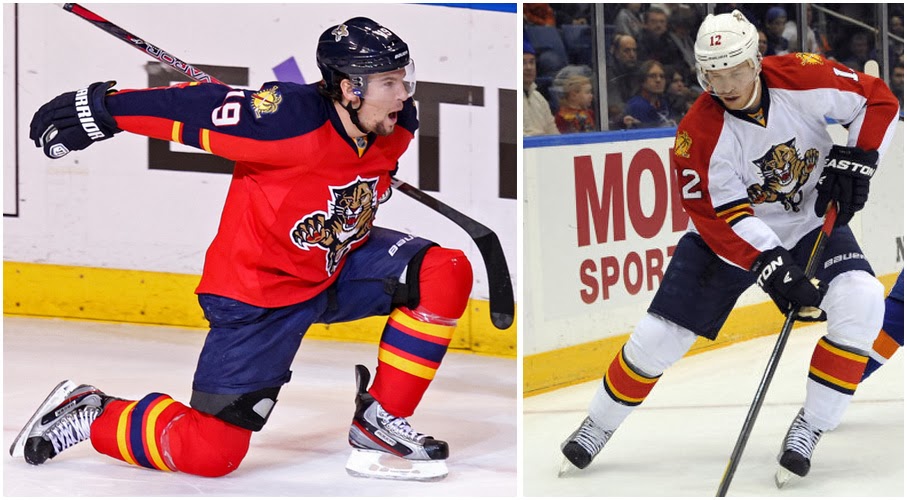
Another example of the colors not matching, with a lighter, brighter red on the home uniform versus the road whites. The actual logo is a little boring, no? Also, I just hate those stupid half-stripes on the sleeves of both uniforms, and the different forms of stripes on the socks. I just think there's too many differences between home and road, all nonsensical and neither versions are all that great.
26.) Phoenix Coyotes

The road uniform looks quite nice, with the brown color showing better as a secondary color than the primary one. The home uniform has way too much of that brown, and it takes over the uniform, making the logo blend into the background too much. Also, I have no idea why they invented a new logo for the alternate black jersey, as that logo is not apparent anywhere else.
25.) Carolina Hurricanes

The Hurricanes slightly changed their uniform for this season, removing a lot of stripes and extra fittings that are apparent on most hockey uniforms, and going with a more simple look. This was a case, for me, of subtraction by subtraction. The home uniform has too little black (which was not the case in the earlier version), while the stripe scheme of the road uniform is a little strange, with that large red stripe and two awfully thin black ones.
24.) Colorado Avalanche

The Avalanche embraced the Reebok designs added five years ago well for both uniforms. The diagonal chest stripes match parallel with the sides of the 'A' logo, which is nice. The Logo itself has aged really nicely over the years, as has the consistent use of the Abominable Snowman footprint. What hurts is the maroon color that is a tad ugly, and the pathetic ripoff of the Rangers with their alternate uniform.
23.) Columbus Blue Jackets

The Blue Jackets new logo is definitely cleaner than their old one, and has a innovative use of the unique shape and look of the Ohio state flag, but overall there is too much of an over red-white-and-blue appeal to the uniform. I have to remark on their third uniform. The circular logo has slowly pervaded around the league in the last few years, but this is definitely the strangest. Not only did the Blue Jackets invent a logo for it, but an entirely new color scheme to boot, which is definitely an interesting decision.
22.) Washington Capitals

The red-white-and-blue works a lot better for the Capitals, obviously, but I think the jerseys are a little too busy here, with sleeve stripes and lines, with a busy logo that takes up too much space. The alternate jersey is even busier with the added stars, but at least presents the 'Capitals' in an easier to read way. The red-white-and-blue is timeless look, and they could shoot up the charts by just cleaning it up a bit.
21.) Calgary Flames

You look at those three jerseys, and what immediately stands out is how much better their retro Alternate jersey is to the current home jersey. The Alternate is the actual reverse image of the road jersey (red where there was white, and vice versa). Also, the Canadian Flag patch is a little much, right? We know you're in Canada. Other than that, the logo is a classic, but I wish they ditch the black-filled home jersey for that beautiful alternate.
20.) Ottawa Senators

I love the symmetry and cleanliness of the hone and road jerseys. No extra stripes, no pointless colors, just a deep base, black sleeves, and a large Senator. But that logo contains the problem. It's a little too AHL-ish and cartoonish. Their earlier, less menacing, more 2D Senator was better. Still, at least they have the same Senator on home and away now (for a while they used the 2D at home and the current 3D for away). The third jersey, despite looking really retro, is actually a new, fan-created, design, which is really nice.
19.) Winnipeg Jets

The Jets jersey is unique, being the only one in the NHL to use the circular crest logo for home and away, and it is the simplest, but among the most effective, of those crests. The Jet over the Maple Leaf, is a simple, but effective logo. My only real issue with the uniform is the strange abundance of light blue trim, when that color is not present in the logo or wording. It's everywhere on both jerseys. Not necessarily a bad color, but a strange addition when the logo itself has three strong colors.
18.) Los Angeles Kings

The Black-and-White would have been nicer if the Raiders were still in L.A. (of course, which could happen by 2015), but it is a solid look that is somehow unique in the NHL. I'm fine with them removing almost all of the purple from their jerseys, differentiating themselves from the Sacramento Kings. The shield logo is also really nice. It's a pretty unique jersey, though has nothing special enough to make it get higher.
17.) Pittsburgh Penguins

The logo is nice, but the colors are just awful. I realize they're in the business of Pittsburgh Sports and wanted to go black and gold, but they've decided that gold is a different gold than the Steelers and Pirates. When the two older teams in that area wear a certain type of gold, the Penguins should as well. They used to, but when they incorporated the dancing penguin, they decided to go with the softer gold, which I am just against.
16.) Anaheim Ducks

The Ducks went from, quite literally, a cartoon logo, to a really nice one that is aging really well. The soft use of orange on the home and road uniform is really nice, a sharp trim that works really well (granted, it works less well in a more prominent role in the alternate uniform). I love when the logo gets incorporated in the lettering, which they do with the 'D' logo as the 'D' in 'Ducks'. So why is it so relatively low? The use of black. Black is an overused color for a lot of teams, and the Ducks really don't need it.
15.) New York Islanders

They have a Top-10 home and road set, but a Bottom-Everything alternate uniform. That alternate is awful, the most recent in a long line of bad alternate Islanders uniform (see: Gordon the Fisherman). Still, the actual uniforms have returned to their dynastic roots, shelving the darker colors for the classic look. The color scheme is close to identical to Edmonton's, which isn't a good thing to blindly copy, but it works really nice. Love the logo as well.
14.) New York Rangers

The Rangers are the lowest ranked of the Original 6, which goes to show just how good those uniforms are. I'm not really sure why. Honestly, the Top-20 hockey jerseys are better than the other two sports I'm doing. It gets hard here. I guess I'm not a huge fan of the diagonal lettering on the jersey. Also, too many stripes on the road uniform. These are nitpicky issues, but something has to be differentiating factors.
13.) San Jose Sharks

The Sharks previous jersey was almost the same but had more elements. It had shoulder stripes and and bottom stripes. It was glorious, if a little busy. This is too simple, so much so that some critics called it a practice jersey. It is simple, but that simplicity leaves the best parts of the original uniform, the great color scheme and the awesome logo. That logo incorprates the Shark, a hockey item, looks menacing, and is not too busy. Just an awesome logo.
12.) Minnesota Wild

The Wild were the first team to use the circular crest as their main logo, and it looks stunning. I would love to see it on their road jersey (instead of the old, but still quite good, bear logo). The Wild logo is very detailed, but looks good from afar and up close. That circle pops out from the dark red and dark green. The alternate is also stunning. What hurts is that road uniform. They should really either switch the road uniform to the lettering of the alternate or the circle crest of the home jersey. It's a little strange to have three different uniform types.
11.) Buffalo Sabres

The Sabres messed around with that red and black thing, then the Buffa-Slug, and finally just returned to their roots, with the Buffalo and the Swords. And Hey, guess what? It worked really, really well. The colors are unique and pop beautifully. The Circle crest works. The stripes are consistent and contrast well. Just a strong looking team overall.
10.) St. Louis Blues

The Blues get credit for having a great logo, and a good solid color scheme that doesn't go overboard. The Yellow trim pops on either jersey, the shoulder yoke color is nice on both. The design is the same but the colors are different, which are nice. Now, the alternate needlessly tries to go retro, but it still works better than most overt retro attempts. That logo is the real star, though, with the Jazz Note mixing with a puck and stick.
9.) Philadelphia Flyers

The only strange part of the Flyers uniform is the fact that the nameplate is colored white or orange, contrasting with the back of the jersey. It is unique, and doesn't look bad, but it is a strange choice. As for the actual jersey, much like the Blues, it's the exact same design but with different colors. The logo is a timeless classic. The color scheme is really unique, and just the large quantity of orange quickly creates a visual identity that works well.
8.) Montreal Canadiens

Just like the four Original Six teams left on the list, the Canadiens have a great, timeless, iconic logo. The only reason they aren't Top-5 is the blue stripe on the home uniform that goes from sleeve to across the chest to the other sleeve. It's a unique element that doesn't look bad, but it just asks the question, why? Why have a large element like that in the home uniform and not have it on the road one. And the road one looks so much cleaner. Still, hard to fault anything with the logo.
7.) Vancouver Canucks

They would be Top-5 if they took out the 'Vancouver' above the logo on the home and road uniforms. The logo was, and still is, great, and I give them credit for having the white tail on the home uniform and the blue tail on the road one to create more contrast. I love the consistency of the green stripe at the bottom, and that shade of green works so well with the shade of blue they use. Love the shoulder logo, and the pointed font they use for numbers and names. Just a really nice, modern uniform.
6.) Boston Bruins

They lose some points for the third uniform, though they rarely use it anymore. The jersey look is awesome. The color scheme works (interestingly, they would do better in Pittsburgh as the shade of yellow actually matches). Nice stripes, nice contrast, no extra colors. Everything worked really, really well. But so does everything for all the remaining uniforms.
5.) New Jersey Devils

Sure, there is some homerism ranking them this high, but what is there to complain about the uniform. The logo is great, with the Devil and NJ meshing so well. The stripes are large, but simple and effective. The black shoulder stripe is great. The colors are timeless, contrasting perfectly. The Devils have never had a third jersey apart from their extremely infrequently used Christmas Tree throwback, which gains them points in my book. They avoided the temptation to put out a black uniform, staying with Devil Red. It's worked in every form.
4.) Edmonton Oilers

They finally removed themselves from stupid uniforms from their roster, and what remains is such a good look. I love the Oilers circle logo. I love the color scheme, the beautiful orange and blue mix. It works so well, especially on that gorgeous road uniform. The alternate isn't bad, but I could do without it. The bottom and sock stripes are so strong. It helps that they won five Cups in this uniform, but it is a timeless look.
3.) Toronto Maple Leafs

Two colors. That's all there is on the Leafs uniforms. A lot of Blue, and a lot of White. I love that the road uniform is the exact same as the home uniform, but everywhere there was blue now there is white. It is so simple, but so awesome. The logo is great, the lettering is great. The shoulder leaf is intricate and nice. The sock stripes are unique and amazing. Absolutely everything works. My only quibble keeping them from Top-2 status is no Original Six team needs an alternate jersey.
2.) Chicago Blackhawks

The absolute best logo in sports. Sure, people can bring up the native american criticism, but it honors the natives, the warrior aspect of their people. It is an absolutely stunning, intricate work of art. The shoulder logo is really nice as well. The road uniform might be the best uniform in all sports everywhere in the world. The reason it isn't number one is the logo and stripes work about 5% less on the red. The red is so sharp that it doesn't hurt their overall work, but it dampens how glorious the logo is.
1.) Detroit Red Wings

Replace everything I wrote in the Maple Leaf section with 'Red' instead of 'Blue' and it matches the Red Wings. The one difference? The Red Wings have the better logo. The wheel itself is as intricate as the Blackhawk face. Complex, embroidered, it is a piece of art. Another random, but great, part of the Red Wings look is that they use vertical arching for their lettering on the back, as opposed to radial or straight letters that every other team uses. It's the simplest (only one, thick stripe on each), but the most beautiful.
I actually thought the old Lightning uniform, the jersey they won their cup in, was quite good. The new one has so many problems. First, the cartoonish outline of the Bolt logo. Then the randomly put 'Tampa Bay' above the logo on the road jersey (very, very few hockey jerseys have enough space to get away with that), then that terrible nickname of a nickname alternate jersey. Just a complete mess trying to play off the color scheme of the Maple Leafs.
29.) Nashville Predators
Another team's jersey ruined by a cartoonish logo. This creature is truly reprehensible, with ridiculously large teeth obscuring what could be a menacing look. The yellow is also just an ugly color at that level on the home uniform. The road uniform looks nice (I should mention hockey uniforms by and large are very good, so these rankings were hard), but the yellow is so overpoweringly bad.
28.) Dallas Stars
Is it me or is the green on the home uniform not the same green on the road uniform? If so, that is pretty inexcusable, especially for a team trying to make a new identity after finally shedding the North Stars color scheme. Too many logo versions are present, with a different main logo, shoulder patch and hip patch. The actual logo is quite bad, a mess that is hard to read. It's amazing how many of the new jerseys are in the bottom of this list.
27.) Florida Panthers
Another example of the colors not matching, with a lighter, brighter red on the home uniform versus the road whites. The actual logo is a little boring, no? Also, I just hate those stupid half-stripes on the sleeves of both uniforms, and the different forms of stripes on the socks. I just think there's too many differences between home and road, all nonsensical and neither versions are all that great.
26.) Phoenix Coyotes
The road uniform looks quite nice, with the brown color showing better as a secondary color than the primary one. The home uniform has way too much of that brown, and it takes over the uniform, making the logo blend into the background too much. Also, I have no idea why they invented a new logo for the alternate black jersey, as that logo is not apparent anywhere else.
25.) Carolina Hurricanes
The Hurricanes slightly changed their uniform for this season, removing a lot of stripes and extra fittings that are apparent on most hockey uniforms, and going with a more simple look. This was a case, for me, of subtraction by subtraction. The home uniform has too little black (which was not the case in the earlier version), while the stripe scheme of the road uniform is a little strange, with that large red stripe and two awfully thin black ones.
24.) Colorado Avalanche
The Avalanche embraced the Reebok designs added five years ago well for both uniforms. The diagonal chest stripes match parallel with the sides of the 'A' logo, which is nice. The Logo itself has aged really nicely over the years, as has the consistent use of the Abominable Snowman footprint. What hurts is the maroon color that is a tad ugly, and the pathetic ripoff of the Rangers with their alternate uniform.
23.) Columbus Blue Jackets
The Blue Jackets new logo is definitely cleaner than their old one, and has a innovative use of the unique shape and look of the Ohio state flag, but overall there is too much of an over red-white-and-blue appeal to the uniform. I have to remark on their third uniform. The circular logo has slowly pervaded around the league in the last few years, but this is definitely the strangest. Not only did the Blue Jackets invent a logo for it, but an entirely new color scheme to boot, which is definitely an interesting decision.
22.) Washington Capitals
The red-white-and-blue works a lot better for the Capitals, obviously, but I think the jerseys are a little too busy here, with sleeve stripes and lines, with a busy logo that takes up too much space. The alternate jersey is even busier with the added stars, but at least presents the 'Capitals' in an easier to read way. The red-white-and-blue is timeless look, and they could shoot up the charts by just cleaning it up a bit.
21.) Calgary Flames
You look at those three jerseys, and what immediately stands out is how much better their retro Alternate jersey is to the current home jersey. The Alternate is the actual reverse image of the road jersey (red where there was white, and vice versa). Also, the Canadian Flag patch is a little much, right? We know you're in Canada. Other than that, the logo is a classic, but I wish they ditch the black-filled home jersey for that beautiful alternate.
20.) Ottawa Senators
I love the symmetry and cleanliness of the hone and road jerseys. No extra stripes, no pointless colors, just a deep base, black sleeves, and a large Senator. But that logo contains the problem. It's a little too AHL-ish and cartoonish. Their earlier, less menacing, more 2D Senator was better. Still, at least they have the same Senator on home and away now (for a while they used the 2D at home and the current 3D for away). The third jersey, despite looking really retro, is actually a new, fan-created, design, which is really nice.
19.) Winnipeg Jets
The Jets jersey is unique, being the only one in the NHL to use the circular crest logo for home and away, and it is the simplest, but among the most effective, of those crests. The Jet over the Maple Leaf, is a simple, but effective logo. My only real issue with the uniform is the strange abundance of light blue trim, when that color is not present in the logo or wording. It's everywhere on both jerseys. Not necessarily a bad color, but a strange addition when the logo itself has three strong colors.
18.) Los Angeles Kings
The Black-and-White would have been nicer if the Raiders were still in L.A. (of course, which could happen by 2015), but it is a solid look that is somehow unique in the NHL. I'm fine with them removing almost all of the purple from their jerseys, differentiating themselves from the Sacramento Kings. The shield logo is also really nice. It's a pretty unique jersey, though has nothing special enough to make it get higher.
17.) Pittsburgh Penguins
The logo is nice, but the colors are just awful. I realize they're in the business of Pittsburgh Sports and wanted to go black and gold, but they've decided that gold is a different gold than the Steelers and Pirates. When the two older teams in that area wear a certain type of gold, the Penguins should as well. They used to, but when they incorporated the dancing penguin, they decided to go with the softer gold, which I am just against.
16.) Anaheim Ducks
The Ducks went from, quite literally, a cartoon logo, to a really nice one that is aging really well. The soft use of orange on the home and road uniform is really nice, a sharp trim that works really well (granted, it works less well in a more prominent role in the alternate uniform). I love when the logo gets incorporated in the lettering, which they do with the 'D' logo as the 'D' in 'Ducks'. So why is it so relatively low? The use of black. Black is an overused color for a lot of teams, and the Ducks really don't need it.
15.) New York Islanders
They have a Top-10 home and road set, but a Bottom-Everything alternate uniform. That alternate is awful, the most recent in a long line of bad alternate Islanders uniform (see: Gordon the Fisherman). Still, the actual uniforms have returned to their dynastic roots, shelving the darker colors for the classic look. The color scheme is close to identical to Edmonton's, which isn't a good thing to blindly copy, but it works really nice. Love the logo as well.
14.) New York Rangers
The Rangers are the lowest ranked of the Original 6, which goes to show just how good those uniforms are. I'm not really sure why. Honestly, the Top-20 hockey jerseys are better than the other two sports I'm doing. It gets hard here. I guess I'm not a huge fan of the diagonal lettering on the jersey. Also, too many stripes on the road uniform. These are nitpicky issues, but something has to be differentiating factors.
13.) San Jose Sharks
The Sharks previous jersey was almost the same but had more elements. It had shoulder stripes and and bottom stripes. It was glorious, if a little busy. This is too simple, so much so that some critics called it a practice jersey. It is simple, but that simplicity leaves the best parts of the original uniform, the great color scheme and the awesome logo. That logo incorprates the Shark, a hockey item, looks menacing, and is not too busy. Just an awesome logo.
12.) Minnesota Wild
The Wild were the first team to use the circular crest as their main logo, and it looks stunning. I would love to see it on their road jersey (instead of the old, but still quite good, bear logo). The Wild logo is very detailed, but looks good from afar and up close. That circle pops out from the dark red and dark green. The alternate is also stunning. What hurts is that road uniform. They should really either switch the road uniform to the lettering of the alternate or the circle crest of the home jersey. It's a little strange to have three different uniform types.
11.) Buffalo Sabres
The Sabres messed around with that red and black thing, then the Buffa-Slug, and finally just returned to their roots, with the Buffalo and the Swords. And Hey, guess what? It worked really, really well. The colors are unique and pop beautifully. The Circle crest works. The stripes are consistent and contrast well. Just a strong looking team overall.
10.) St. Louis Blues
The Blues get credit for having a great logo, and a good solid color scheme that doesn't go overboard. The Yellow trim pops on either jersey, the shoulder yoke color is nice on both. The design is the same but the colors are different, which are nice. Now, the alternate needlessly tries to go retro, but it still works better than most overt retro attempts. That logo is the real star, though, with the Jazz Note mixing with a puck and stick.
9.) Philadelphia Flyers
The only strange part of the Flyers uniform is the fact that the nameplate is colored white or orange, contrasting with the back of the jersey. It is unique, and doesn't look bad, but it is a strange choice. As for the actual jersey, much like the Blues, it's the exact same design but with different colors. The logo is a timeless classic. The color scheme is really unique, and just the large quantity of orange quickly creates a visual identity that works well.
8.) Montreal Canadiens
Just like the four Original Six teams left on the list, the Canadiens have a great, timeless, iconic logo. The only reason they aren't Top-5 is the blue stripe on the home uniform that goes from sleeve to across the chest to the other sleeve. It's a unique element that doesn't look bad, but it just asks the question, why? Why have a large element like that in the home uniform and not have it on the road one. And the road one looks so much cleaner. Still, hard to fault anything with the logo.
7.) Vancouver Canucks
They would be Top-5 if they took out the 'Vancouver' above the logo on the home and road uniforms. The logo was, and still is, great, and I give them credit for having the white tail on the home uniform and the blue tail on the road one to create more contrast. I love the consistency of the green stripe at the bottom, and that shade of green works so well with the shade of blue they use. Love the shoulder logo, and the pointed font they use for numbers and names. Just a really nice, modern uniform.
6.) Boston Bruins
They lose some points for the third uniform, though they rarely use it anymore. The jersey look is awesome. The color scheme works (interestingly, they would do better in Pittsburgh as the shade of yellow actually matches). Nice stripes, nice contrast, no extra colors. Everything worked really, really well. But so does everything for all the remaining uniforms.
5.) New Jersey Devils
Sure, there is some homerism ranking them this high, but what is there to complain about the uniform. The logo is great, with the Devil and NJ meshing so well. The stripes are large, but simple and effective. The black shoulder stripe is great. The colors are timeless, contrasting perfectly. The Devils have never had a third jersey apart from their extremely infrequently used Christmas Tree throwback, which gains them points in my book. They avoided the temptation to put out a black uniform, staying with Devil Red. It's worked in every form.
4.) Edmonton Oilers
They finally removed themselves from stupid uniforms from their roster, and what remains is such a good look. I love the Oilers circle logo. I love the color scheme, the beautiful orange and blue mix. It works so well, especially on that gorgeous road uniform. The alternate isn't bad, but I could do without it. The bottom and sock stripes are so strong. It helps that they won five Cups in this uniform, but it is a timeless look.
3.) Toronto Maple Leafs
Two colors. That's all there is on the Leafs uniforms. A lot of Blue, and a lot of White. I love that the road uniform is the exact same as the home uniform, but everywhere there was blue now there is white. It is so simple, but so awesome. The logo is great, the lettering is great. The shoulder leaf is intricate and nice. The sock stripes are unique and amazing. Absolutely everything works. My only quibble keeping them from Top-2 status is no Original Six team needs an alternate jersey.
2.) Chicago Blackhawks
The absolute best logo in sports. Sure, people can bring up the native american criticism, but it honors the natives, the warrior aspect of their people. It is an absolutely stunning, intricate work of art. The shoulder logo is really nice as well. The road uniform might be the best uniform in all sports everywhere in the world. The reason it isn't number one is the logo and stripes work about 5% less on the red. The red is so sharp that it doesn't hurt their overall work, but it dampens how glorious the logo is.
1.) Detroit Red Wings
Replace everything I wrote in the Maple Leaf section with 'Red' instead of 'Blue' and it matches the Red Wings. The one difference? The Red Wings have the better logo. The wheel itself is as intricate as the Blackhawk face. Complex, embroidered, it is a piece of art. Another random, but great, part of the Red Wings look is that they use vertical arching for their lettering on the back, as opposed to radial or straight letters that every other team uses. It's the simplest (only one, thick stripe on each), but the most beautiful.