I went to Cape Town this past long weekend, a fifth trip there - one that very much echoed my fourth trip over President's Day Weekend in 2020, right before Covid. This was not to say after, but definitely after the end of Omicron, and it was a joyous return to the Western Cape. One may ask why go to a place 8,000 miles away five times in a nine year span (Feb '13, Jan '16, Oct '18, Feb '20, Feb '22). Well, in 26 different ways, this is why:

One of the few 'new' pieces of tourism from this trip was my trip venturing out towards Hout Bay to go the the World of Birds Wildlife Park, which was just a great, large, sprawling, park with so many incredible moments. From so many parrots, to birds so used to humans they just walk around you, to a few monkeys thrown in. The park had some incredible birds not behind cages but in covered aviaries, with owls staring at you with their huge eyes, and beautiful parakeets of every color. Cape Town is not the home for incredible fauna in Africa, but there is still some incredible wildlife here, especially in this contained space.
B is for Belly of the Beast

This single service, 25-seat restuarant in an up and coming part of Cape Town is just a perfect slice of heaven. For a truly reasonable price of around $45, you can eat just exquisitely prepared food, if not overly refined and tweezery, with just incredible combinations of flavours. Everything sourced locally, everything prepared by about six or seven chefs right in front of you, in this really touching space. Belly of the Beast has over multiple trips now become my favorite dinner in Cape Town.
C is for Cause Effect

I first went to Cause Effect in 2020, as it opened up in the foot of the Waterfront, and showcased brilliant cocktails with incredible combinations, insane presentations and dynamic performances by the bartenders concocting them. At the time I was astounded at the audacity of this place in a most commercial area. It had all the makings of a world class cocktail bar without any of the trappings or overbearing price tag of one. By my 2022 trip, it got a rank on the World's Best Bar list (#61, I figure it will be in the Top 50 fairly soon), and didnt lose any of its charm. It is a perfect place and a great addition to the Waterfront.
D is for the Dubliner

The Dubliner is an Irish Pub on Long Street that was an institution of my early Cape Town visits, particularly my trip in 2016. Overtime I got more adventurous, but there was still one last magical night in The Dubliner - my Sunday night in 2020, the last night of my trip. I was off Monday, but obviously Cape Town writ large wasn't. Well, no worry, as The Dubliner stayed open until 3am with a live one-man guitar guy who played great music, allowed people to come on stage and sing (which I did), and I ended up partying with a group of Germans all night. Long Street is becoming less a less a part of my trips (more of that in the 'L') but there are some great memories having survived a night at the Dub.
E is for Escape
I've been asked before why I keep going back to Cape Town. Going five times over a nine-year span seems ridiculous, especially on the last two occassions going for five days each time. But in my defense, there is a certain sense that this is my playground. I know what I like in Cape Town (which is a whole lot). I have not come close to losing a bit of my love for the city. The second you land in that perfect weather (I've been very lucky in that regard), you just get a smile on your face. It is my escape, my happy place. I certainly have others, but no city has that draw for me that Cape Town does and likely will always have.
F is for First Thursday

The first Thursday of the month is termed First Thursday and is basically a monthly extravaganza of festivals and art during the day and debaucherry at night. From what I gather it isn't like First Friday is something of a holiday, but there is this general sense that First Thursday is an institution. I've only directly experienced it once, in 2018, and all I can say is bars, lounges and clubs were busier on First Thursday than on the Friday or Saturday that followed. It seems clear that First Thursday is truly unbeatable.
G is for Good Hope
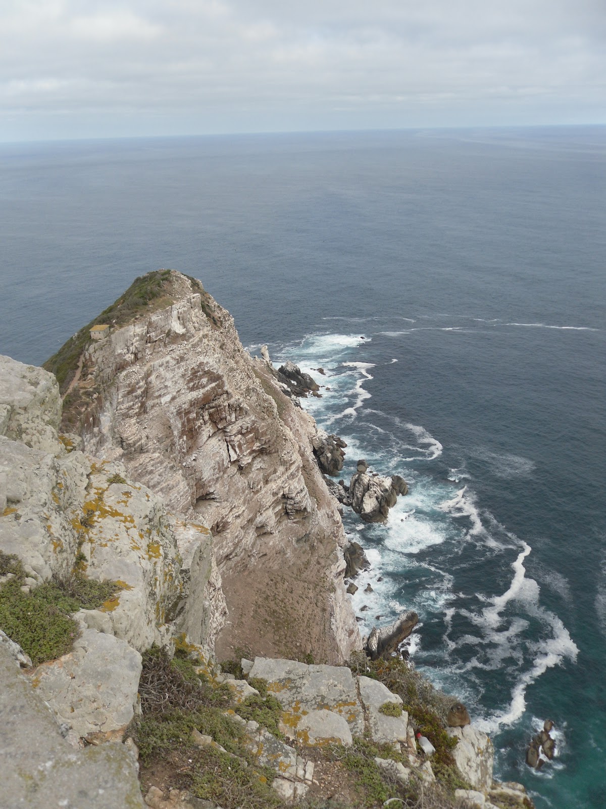
There's a few things on this list that were most, or only, relevant on my first trip in 2013, and this was one of them, a full day trip down towards the Cape of Good Hope. It isnt the southernmost point in Africa, but the one that most represents the meeting of the Indian and Atlantic oceans. More though was the incredible scenery, the rolling mountains all the way down, the almost Amalfi-Coast esque views of beach towns below the road and the mountains above. I went on the Cape of Good Hope tour on just my second day in South Africa, and it is still so memorable so much later. It is a must for any first time visitor to Cape Town.
H is for Hikes

The hikes abound all over Cape Town, most all centering around the rock formations of Table Mountain and the mountain range that extend southward. My two most common ones are the Countour Path from Constantia Nek to Kirstenbosch on the back side of Table Mountain, with lush green views, forest and greenery. Also its a free way into Kirstenbosch as the end of teh trail leads right into the park. The other is the Pipe Track which extends from basically the intersection of Table Mountain and Lion's Peak and goes on the other side of Cape Town, with Amalfi-coast-esque views of the beaches and towns down towards the Cape of Good Hope. Their both brilliant hikes, with such different but equally nice scenery.
I is for (p)Inotage

Yeah, sue me, I'm very much cheating here. I really couldn't think of anything with 'I' and wanted to talk about Stellenbosch. I'm not a wine person; mostly a beer one. Well, I can confidently say the one thing that Cape Town does not do well is craft beer. That's fine, they do wine really well - the hallmark being their noted Pinotage. Stellenbosch itself is also a glorious wine region, every bit as beautiful as Napa or Colchagua or others.
J is for Janse & Co

This is a sad one to right as it's now closed, though the chef & owner reopened it is a seemingly quite similar restaurant I may check out in my next trip. Janse & Co was a perfect little sot where you could pick 6-8 courses of about 15 they had, all with very South African fish and meat and ingredients. Some of the options they had here were incredible, from lamb, to linefish, to so many others. Cape Town has some incredible restaurants, but spots like Janse & Co, right in the middle of a busy street with bars and lounges, was what I liked most about its food scene.
K is for Kirstenbosch

Kirstenbosch Botanical Gardens is a sprawling park on the back-side of Table Mountain, with an equally imposing, if very different, view of the mountain above. It's huge, with different flower sections, canopies, all kinds of flowers and lush greenery. Kirstenbosch is easily the best, most complete and exhaustive botanical garden I've ever been to. The last two times it was a spot that was used just as the tail end of the Constantia Nek hike, but still the beauty was no different.
L is for Long Street

Long Street was known mainly as backpacker and party central in Cape Town. It is still backpacker central, with a good number of hostels littering it streets. However, its status as the main party area has reduced drastically in even my time visiting, with other neighborhoods taking over for the 'rich' crowd (which given price parity, I am in South Africa). But there are a few gems that remain - particularly The Waiting Room, a great mix of R&B, Hip Hop and EDM with an open balcony next to the dance floor. I spent a lot of time there in my 2018 trip - a trip where a lot of time was alternated between The Waiting Room and the nearby Fiction, a more edm club that closed since. Beyond the rest of the places which I admit are a bit more urban, there is still just a life and energy on Long Street, to the point this time they closed the street in its busiest area for cars. It is still a special place, if one that is becoming a less constant place.
M is for Miller's Thumb

I failed to go to Miller's Thumb my first two trips there despite it being a top ranked restaurant on TripAdvisor. It had dropped to #5 or something by my trip in 2018 but I was still incisive that I must go. It's a mom and pop (literally, the pop is the chef, the mom runs the front of house), with a fairly simple concept: there's five or six African fish on a blackboard that you can order in different preparations (along with great apps, and great deserts and meat for some reason). The quality hasn't suffered at all. Cape Town itself has become something of a food paradise, but this simple establishment with its hilariously garish orange and green walls just works.
N is for Nostalgia

I have long wondered how much my love for Cape Town is the fact that it was the first place I went to on my Round the World Trip in 2013, a last minute add when I got too nervous to go to Egypt. And there is some nostalgia in there, but in reality even on my 3rd and 4th and now 5th trip, the same wide-eyed wonder of Cape Town's beauty and many joys hasn't waned at all. Of course I am still nostalgic for the true wonder and one memory in particular and a perfectly nostalgic, random one at that: walking from my hostel to the Waterfront past the beautiful soccer stadium, with Nicki Minaj's "Starships" playing, one of the songs that defined the movie Pitch Perfect which I watched on my flight from JFK to Johannesburg. These random memories of wonder and joy I hope never leave, even if I make a 10th trip one day.
O is for Ostrich and all meants

Ostrich will stand in for a bevy of rare African fauna that is all so available in Africa. From Ostrich, a great bird, to warthog, a perfectly gamey swine, to kudu, gembok, springbok and even crocodile. Cape Town was the first place I really went outside my comfort zone with meats, something I went fully into later on my Round the World trip. For opening my eyes to more interesting meats than just chicken, pork, beef and lamb (some of which Cape Town does well also of course), Cape Town gets it dues.
P is for Penguins

The Cape Town penguins live towards the south and the Cape of Good Hope, particularly in Simon's Town. This is a standard stop in any Cape of Good Hope, and was my first time seeing penguins in the wild back in 2013. I've since seen them n Patagonia, and while they were probably cuter in Patagonia, still a love affair with a small, adorable little flightless bird stated in Africa. I've since focused a lot of my souvenir buying into penguin-esque figurines and linens, which admittedly is silly, but then again just look at a penguin and try to resist.
Q is for Quay Four Tavern

On my first trip in 2013, I was hesitant the first few days to go exploring too far away from teh Waterfront, whose first-world charms were a better match than Long Street. The place that got me to lose my shackles a bit was a night at Quay Four Tavern, which is right in the middle of the waterfront. I went there for dinner and beers as they had live music and a Real Madrid v Barcelona match playing (Real won, 3-1). It was there I met a group of Cape Towners who invited me to a night out on Long Street, and a further love of the non-Waterfront areas began.
R is for Reset (RIP)

The first time I went to Reset, a techno/EDM dual-level club in heart of Cape Town was not by direct choice. No, it was a few French guys taking me there after consoliing me for losing my phone in the The Waiting Room (I got it back). It was great then. I actively went twice on my trip in 2020 and it was great that time as well. Never too crowded, never too expensive, with a great vibe and great music. Sadly it seems to have closed for good, and while there are decent alternatives (Modular is a particularly decent one) none will touch the mix of refinement and fun that was Reset.
S is for Signal Hill

My pick for the place with the single best views on earth (that is reasonably easy to get to - so not like in the Himalayas or something) is Signal Hill. Precisely because you see the sprawling city below you, you see Table Mountain in all its glory above you, you can see down towards the Cape of Good Hope and of course the vast expanse of water that is the Atlantic Ocean. It is also my pick for best sunset I've ever seen, as you can watch the sun slowly descend over the Atlantic. The only downside is it gets so crowded unless you've hired a car getting an uber back will be tough. But still worth the effort for breathtaking views in every direction.
T is for Table Mountain

In five visits to Cape Town, I've taken the trip up Table Mountain twice - so half as many times as visiting Signal Hill. And personally I think that matches that Signal Hill is a better view - mainly because the view there includes Table Mountain in it. Table Mountain is such a perfect natural structure, just everpresent among Cape Town, visible from basically every part of the city. It welcomes you both when landing from the air or in the drive into the city. Almost every great, common hike is on, around or through it. The view from teh top is famous and worth doing for sure, but to me this plainly incredibly beautiful natural structure is best viewed from below, with all its splendor.
U is for United

I just want to thank my lovely United Airlines for starting their Newark -> Cape Town direct flight back in Nov 2019, which has made it so much easier to get there. That flight was usually just in the US winer but of course didn't run from Nov '20 - Mar' 21 due to the pandemic. With Omicron hitting worst in South Africa in Nov '21 I was very fearful it wouldn't come back. But it did, and it was full both ways. And it's glorious. Quick fact - it is also the route with the most time spent over water. Basically from ten minutes post takeoff in New Jersey to five minutes before landing in Cape Town, you are over the Atlantic. Truly stunning stuff.
V is for V&A Waterfront

It's hard to truly describe what the V&A Waterfront means to me in terms of my love of Cape Town. I've probably spent more time there than any other place. I usually stay near it and probably have spent time roaming around it every single day. From the incredible views, to the great shopping, to the food markets, the cocktail bars, the great restaurants, the great buskers and the incredible joy of life. The Waterfront is commercial sure, but in every way it is the best type of commercial and posh. It is just an incredible place.
W is for the Watershed

The Watershed is in the Waterfront, but got added by the time of my second trip and has remained a constant for the Waterfront, and for me too. I almost exclusively buy my souvenirs from there because they have a certain quality - mostly art, linens, etc. Yes, it is more expensive than the Greenmarket or even the Neighborhoods Market mentioned earlier, but there is a known quality that keeps me coming back. It is a great time waster as well - one of the jewels in the Waterfront itself.
X is for Xcellent weather (yeah I'm cheating here, but sue me)

The most consistent aspect for Cape Town for me has been the unbeatable weather. Granted I've always gone either in their summer (Jan '16, Feb '13, '20 & '22) or late Spring (Oct '18), but I think in the 23 or so days I've been in Cape Town now it has rained a total of two days and was even cloudy for maybe two more. It's generally been incredible pleasant weather and more often than not a perfect shade of blue in the sky. Just look at that picture, taken in my 2013 trip, of what we're talking about.
Y is for Youth Hostels

The first two times I went to Cape Town I stayed in Youth Hostels - first the Altona Lodge in 2013, and then the Sunflower Stop in 2016, both n the Greenpoint area (close to the Waterfront). These were throwbacks to a time where that was how I largely traveled. Never again, in a sense, as I've never stayed at one on a solo trip since the 2016 trip. I enjoyed my time there, did meet some interesting people, but also I'm somewhat glad I've left that world behind. Even if I don't go traditional staying at AirBNBs the last two times.
Z is for Zero Regrets

Honestly, I'm sure with more time I can come up with a better one, but I've used 'Zero Regrets' for my 'Z' quite a few times so why stop here, because through five trips I have no real regrets. There are certain things I haven't yet done, but those I probably never will, such as a tour of a township - if I were to do this I would rather do in Joburg, and I truly reject that type of tourism having seen people do it in India in the slums. Anyway, Cape Town for me is a perfect place. I think at this point, having gone on five occasions and still loving every moment, has me put it at #1 on my favorite cities list next time we do this, ahead of Madrid. Cape Town is about as perfect a place, and I'm happy that